Behind Golden Glass: Why Visual Interfaces Still Matter in the AI Era
Behind Golden Glass
Why Visual Interfaces Still Matter in the AI Era
There is a popular prediction right now: AI gets better at voice, so interfaces become mostly voice.
I do not buy it.
Voice will become a major interface layer. It already is. But treating that as the end of visual interfaces is a category mistake. It confuses input convenience with cognitive architecture.
Visual interfaces are not a temporary bridge we used before models got smart enough. They are the operating surface for how humans verify, compose, compare, and decide.
This is the design argument behind Golden Glass.
The Voice-Only Fantasy
If voice-only were the natural destination, we would already be drifting there in everyday behavior.
We are not.
People voluntarily spend hours looking at screens: social feeds, films, sports, maps, documents, design boards, dashboards, books. They could consume more via audio. Often they choose not to.
That is not inertia. That is preference.
Visual consumption gives us control over pace and focus. We can scan, zoom, skip, revisit, compare two things side by side, and spot inconsistencies instantly. Voice is excellent for intent capture and quick interaction, but it is linear. Linear channels are poor at dense structural comparison.
So yes, voice expands. But no, visual interfaces do not collapse.
Why Visual Surfaces Are Structurally Necessary
There are three reasons visual interfaces remain fundamental.
1) Shared reference
When two humans, or a human and a system, are working on the same task, they need a shared object to point at. A frame, a timeline, a shape, a layout, a hierarchy.
Without that shared visual surface, collaboration becomes guesswork.
2) Verification
Language is approximate. Good enough for direction, rarely enough for precision.
You can describe a chair in words. You cannot reliably validate the exact proportions, balance, material tension, silhouette, and emotional feel of that chair through words alone.
Even with vivid imagination, you still need to see what the system understood.
3) Spatial and compositional reasoning
A large class of tasks is irreducibly visual: editing, architecture, fashion, product design, interface design, filmmaking, medical imaging, operations planning, mapping, logistics, robotics, and most forms of creative direction.
These tasks require spatial memory, contrast management, depth cues, temporal sequencing, and contextual layering. Voice can assist. It cannot replace the surface where those relationships become legible.
This is exactly where interface design matters.
A Short History of Interface Taste
Interface history is not a straight line from bad to good. It is a cycle between utility, expression, and cultural mood.
Early graphical computing
Graphical interfaces existed in research settings before mainstream personal computing. What Apple did, repeatedly, was help translate interface breakthroughs into products ordinary people could actually live with. The Macintosh era did not invent every primitive, but it mainstreamed a way of seeing software as something navigable, visual, and personal.

The expressive hardware-software era
Then we had periods where technology felt playful and material: translucent plastics, luminous gradients, Frutiger Aero aesthetics, PS2-era environmental mood, media player skins, glossy controls. It was imperfect, sometimes excessive, but it had personality.

Early glass attempts
Windows Vista pushed one of the first large-scale consumer attempts at glass-like interface language. It was not fully mature, but it signaled an intuition that depth and translucency could improve orientation and emotional tone when used well.

Touch and skeuomorphism
The iPhone era made touch-native interfaces mainstream and used skeuomorphic language to teach interaction to millions of users quickly. Again, not perfect forever, but historically effective.
The Wii interface era also proved that playful, legible visual systems could onboard massive non-technical audiences to new interaction models with almost no instruction.


Flat minimalism and monoculture
Then came a long flattening cycle: minimalist grids, sharp contrasts, dark mode saturation, component libraries that made products look increasingly interchangeable. Efficient? yes. Distinctive and humane over long sessions? often not.

The current turn
Now we are seeing a non-trivial shift back toward depth, materiality, and layered interaction. Apple's Liquid Glass move, regardless of taste debates, matters strategically because it reopens interface ambition at platform scale and aligns with spatial computing trajectories.

That move does not end the story. It restarts it.
Why This Shift Is Happening Now
The return of depth is not nostalgia alone. It is functional.
We are moving into a world where:
- AI agents operate continuously in the background
- users need to understand system state at a glance
- tasks span devices and contexts without clean boundaries
- AR hardware becomes progressively mainstream
Flat interfaces are efficient for isolated actions. They are weaker at communicating multi-layer state, active processes, and contextual relationships over time.
As systems become more agentic, interfaces must become more legible as environments.
This is one reason glass languages are reappearing. Not as visual decoration, but as state architecture.
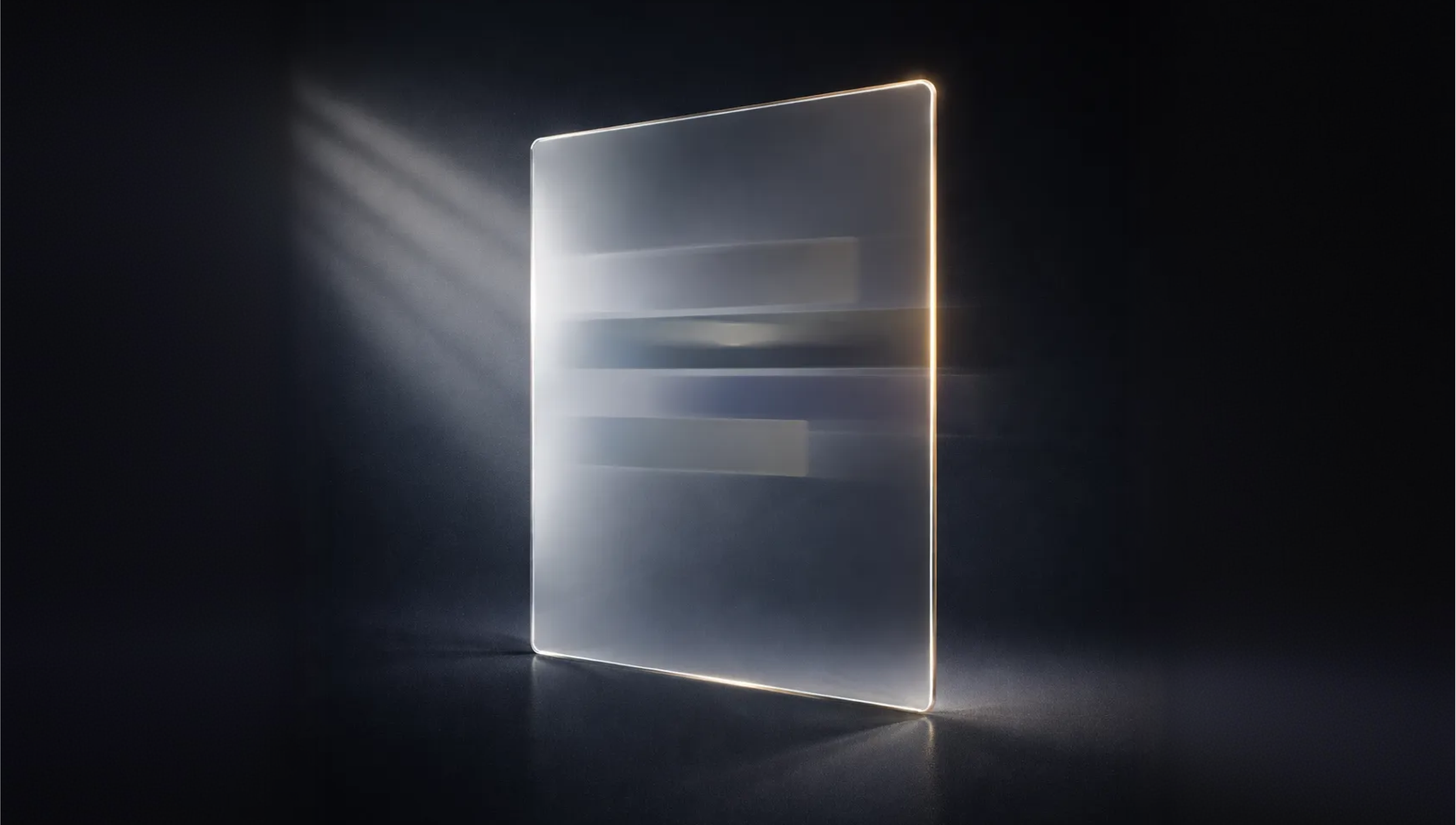
Where We Stand: The Design Thesis Behind Golden Glass
Golden Glass is our answer to this moment.
Not as a trend response. As a product thesis.
Warmth over clinical neutrality
Most contemporary glass systems lean cold, neutral, crystalline. We intentionally moved toward golden tinting because we wanted a premium interface with emotional warmth, not sterile futurism.
Light-angle behavior, not static polish
Golden Glass is not one static effect. It includes a light-angle behavior engine so surfaces react with subtle directional variance. The goal is to make depth feel physically coherent instead of cosmetically layered.
Layer systems, not one repeated shape
We are not applying one reusable translucent card everywhere. We use a play of layers, shadows, edge behavior, textures, and shape families so the interface can communicate hierarchy and context without shouting.
Spatialness as operating logic
The objective is not to make software look fancy. It is to make the system easier to think in. Controls should surface with intent, recede without friction, and preserve continuity while you move across recording, editing, strategy, analytics, and AI interaction.
That is the key point: Golden Glass is designed as an environment, not a skin.
Intelligent Environments Need Visual Intelligence
Rkive is building an AI-native OS as a system of intelligent environments.
In that world, the interface has to do real work:
- hold context across time
- show active system state clearly
- preserve user orientation during parallel operations
- support high-agency human control when it matters
Voice helps with intent. Visual interfaces carry the operational truth.
If the system is continuous, the interface must be continuous too.
Closing
The future is not voice versus visual.
It is conversational intelligence + visual environments, working together.
We will talk to systems more. But we will also keep looking, arranging, validating, and composing. That is how humans work when stakes, taste, and precision are real.
Golden Glass is our commitment to that reality.
Not nostalgia. Not ornament.
A serious interface language for intelligent environments.
Read more from Rkive AI
- Introducing: Golden Glass UI
https://rkiveai.com/resource/news/introducing-golden-glass-ui - Introducing: Ideas
https://rkiveai.com/resource/news/introducing-ideas-where-content-takes-shape
Explore Rkive AI for Editing to see how this design language comes alive in Studio.
About the author
Alberto Luengo is the founder and CEO of Rkive AI. He writes on AI systems, interface design, and product strategy at the intersection of technology, aesthetics, and human behavior.